Population density and the evolution of ownership

Lamborghini Aventador in traffic

Yours. Mine. Even a two year-old can understand the basics of ownership. Those two words are also freighted with meaning, implying volumes about resources, control, privilege, and social standing. But what they don’t say is why it is we care so much about who owns what.

There are a number of possible reasons for why we value our possessions and covet those of others. True to form, I found one paper that suggests that population density may be responsible for the evolution of ownership. It’s a game theoretic study by Japanese behavioral scientist Shiro Horiuchi in which he uses an established mathematical model—the Hawk-Dove-Bourgeois game—to sift through the possible origins of possession in both animals and humans.

The Hawk-Dove-Bourgeois game (HDB) is a modification of the classic Hawk-Dove game. In addition to the two existing player types—hawks, who fight to acquire resources or territory and viciously defend what’s theirs, and doves, who avoid conflict at all costs—HDB adds a third strategy, called bourgeois. Bourgeois are a bit of a hybrid of the two existing approaches. A bourgeois player, when challenged for ownership, will fight furiously to keep it. But unlike hawks, they won’t attack other players to acquire resources.

Horiuchi took this game and threw out the standard dove and bourgeois strategies, replacing them instead with strong and weak bourgeois. Weak bourgeois are more similar to doves, which means they are less likely to engage in conflicts. Strong bourgeois can adopt a hawk- or dove-like stance depending on their territorial boundaries: If the contested area is within their boundaries, they’ll fight like hawks. If not, they’ll sit out like doves. Players can change strategies depending on how well they are doing relative to their neighbors. The goal is to control 10 units of territory.

In layman’s terms, the strong bourgeois strategy is a proxy for ownership in its purest sense—strong bourgeois players only fight to retain what’s theirs; anything else and they abstain from conflict. And what emerged from the games was a clear picture of strong bourgeois dominance at higher population densities. That doesn’t mean strong bourgeois players controlled more territory—remember, they were limited to a maximum of 10 units. Rather it means that more players adopted that strategy, judging that it was the best way to obtain and hold the maximum territory, especially as the playing field became more crowded.

Previous studies that used the unmodified HDB game didn’t come to the same conclusion, arguing that the bourgeois strategy—ownership, in other words—isn’t advantageous when resources are high. But those findings are refuted by real world studies of primates that show groups are willing to defend resource-rich home ranges, Horiuchi points out. His modifications and results more closely match the empirical data and suggest that ownership not only arises as population densities increase, but that it’s the best way to succeed.

As an ecologist, this result did not surprise me. In ecology, resources are everything. Even organisms as sedate as plants compete ferociously for resources, employing competitive tactics that range from rapid growth to chemical warfare. But in modern, developed societies where the bare necessities are frequently met, I wondered how these findings might apply. I ran Horiuchi’s result past a friend of mine who is a social psychologist, and he indicated that ownership today is not merely about resources, but status. Controlling more territory—or even just expressing one’s wealth in ever more ostentatious ways through possessions—is just another way in which the strong bourgeois strategy could continue to exert its influence, even though we’re not struggling to survive.

Frankly, I’m not surprised. Based on anecdotal observations of the various places I’ve lived, possessions appear to play a larger role in people’s lives the denser and more populous a city becomes. In large cities, people who earn double their peers seem more inclined to flaunt that wealth compared with the same individuals in smaller towns. The social psychological explanation makes sense in this case. It’s harder to stand out in denser, more populous places, which may lead to more conspicuous consumption.

Source:

Horiuchi, S. (2007). High population density promotes the evolution of ownership Ecological Research, 23 (3), 551-556 DOI: 10.1007/s11284-007-0408-6

Related posts:

The curious relationship between place names and population density

This is your brain in the city

Disruption and diversity

Erle Ellis writing for Andrew Revkin’s YourDot series:

Humans have caused a net increase in plant species richness across two-thirds of the terrestrial biosphere, mostly by facilitating species invasions. In most regional landscapes, native species losses were significantly lower than exotic species gains, with agriculture species causing minor increases, but ornamental species sometimes play a large role that is still hard to assess.

There’s a growing sentiment that nature doesn’t always have to be defined as pristine wilderness. Given the breadth of human impacts, from species invasions to climate change, it’s arguable that there isn’t any pristine, untouched wilderness left. That’s not to say we should abandon conserving the wilder places, but it’s time we accepted the bits of life all around us for what they are—nature.

Does an airport line have to reach the airport?

Yonah Freemark, writing about the proposal in Washington, D.C., to forgo a direct rail link in favor of a people-mover:

Counter-intuitively, however, such a change in alignment could be a reasonable money-saver and may actually improve transit service for both commuters and air travelers. And though the question is immediately relevant to the Dulles Rail extension, it is equally valid to many cities, as the issue of extending rail networks out towards airports is frequently of concern for transportation planners in major metropolitan areas.

Having lived in the Bay Area, where BART did not connect to Oakland’s airport, and now Cambridge, where the T doesn’t have a direct rail link to Boston Logan, this is something I’ve often pondered. As usual, Freemark adroitly wades through the emotions and arguments to show that direct links aren’t always in riders’ best interests.

What range anxiety?

Christopher DeMoro:

Electric vehicles are finally starting to saturate the market, though some of the same old arguments continue to be made against the limited range of EV’s. But a new study but two doctoral students claims that 95% of all single-destination trips could be made by today’s electric vehicles.

Once we expedite recharging times, there will be no reason not to get an electric car.

Abandoned America

Having grown up in the Midwest, I’ve also seen titans of industry decay into dilapidated ruins. But even after seeing such decline happen in real life, I still find myself clicking through dozens of slideshows of ruin porn like this one. I know I’m not alone.

Most detailed map of U.S. forests yet

Many web sites are billing this as a map of “every tree” in the U.S. Not possible. While it is the most detailed nation-wide map of U.S. forests to date, its resolution is only 30 meters per pixel. That’s good, but not nearly detailed enough to pick out every tree in the country.

Amazonian deforestation reveals lost cities

Simone Romero at the New York Times:

The deforestation that has stripped the Amazon since the 1970s has also exposed a long-hidden secret lurking underneath thick rain forest: flawlessly designed geometric shapes spanning hundreds of yards in diameter.

I see ghosts.

Universities don't want to be saviors

Nate Berg at the Atlantic Cities:

“We really can’t believe that universities can save cities,” said Gene Block, chancellor at the University of California Los Angeles. He argues that even though universities contribute to a city’s culture and economy, they can’t be fully relied upon to solve major foundational problems should they arise.

I think Block and his fellow panelists are being a bit disingenuous. Many state universities were founded with the purpose of disseminating know-how that would help the region prosper. For many public university systems, that was back in the 1800s when the economy revolved around agriculture, mining, and forestry. Many universities retain such extension programs, but haven’t done much to develop analogous departments that focus on cities. Side-stepping the issue like this shows a lack of imagination.

Scaling up

Links

Landscape ecologists commonly cite the need to “scale up” in the course of their research. It’s a bit of jargon that can be loosely defined as the need to incorporate more information, to address the issue with a broader scope. That’s what I’m doing with Per Square Mile.

You may have noticed a few changes to the site since your last visit. The graphic that sprawls across the top of the page is a big bluer, a bit bolder. The layout is also simplified, clearing away the last vestiges of clutter from the old page. But those subtle differences hide myriad modifications under the hood.

For every interesting story I unearth, there are many more being told across the web. The changes I’ve made to Per Square Mile will let me share with you that which I find most compelling, most insightful, or most provocative. I’ll add my two cents and send you on to read for yourself. It’s a model that was originally proposed for blogs but has somewhat been lost. There are a few who hew to the original “weblog” concept—chief among them is John Gruber, who writes the brilliant tech site Daring Fireball and to whom I owe a debt of gratitude for inspiring these changes. Like Gruber, I’ll be collectively calling these posts my Linked List.

How the Linked List works is straightforward. The title is a link to an article on another site. Below is the text of the post. Sometimes I will include an excerpt from the linked page, sometimes I’ll include my own take on the issue, and sometimes I’ll post both. Next to the title is the symbol for infinity, which is the permanent link. Click on that and you will be taken to the single-page view of that Linked List post, which you can then bookmark or share.

The hitch to the Linked List is it will only be available on the site, at least for the time being. So be sure to drop by for the latest updates. And in addition to the Linked List, all the stuff you’ve come to love about Per Square Mile—articles, essays, maps, infographics—isn’t going anywhere. I’m taking that body of work and scaling up.

Photo by BotheredByBees.

Southern regions nurtured languages

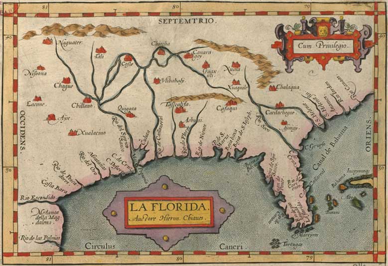
La Florida, by Abraham Ortelius

In the last few years, I’ve had the good fortune of befriending a pair of Italians. Before meeting them, I admit I knew relatively little about Italian culture apart from the typical American stereotypes. I grew up in an area with strong German roots, and the college I attended maintains close ties with Norway. Needless to say, I was not well acquainted with southern European cultures.

But thanks to my friends, that’s been changing. Among other things, I’ve been picking up bits of Italian, both the standard tongue and the Veneto dialect. Italy, I’ve learned, is a country defined by a common language which many Italians don’t speak at home. There doesn’t seem to be much agreement on the exact number of dialects, but estimates range from around a dozen to over 50.

That Italy has so many dialects shouldn’t surprise an astute student of history. The region was heavily balkanized prior to unification in the mid-1800s. But Italy’s dialectal diversity may also be the product of another quirk of geography. A study done in the mid-1990s by two British professors—an evolutionary anthropologist and an evolutionary biologist—revealed a distinct trend in the languages of North American native peoples at the time of European contact. More languages were spoken in southern latitudes and the range over which those languages were spoken was smaller. In other words, language density increased closer to the equator.

The scientists discovered this trend when analyzing the first comprehensive map of the world’s languages, Atlas of the World’s Languages, which was initially published in 1993.¹ Focusing on languages spoken by native peoples when Europeans first arrived, they counted the number of tongues that a line of latitude crossed as it ran east-west across the continent. Their survey spanned 8 ˚N and ended at 70 ˚N, the furthest north an entire latitudinal span was inhabited by humans.

Upon tallying their results, a few things stood out. First, the number of languages peaked at 40 ˚N—the parallel that runs approximately through Philadelphia, Denver, and Reno.² Perhaps coincidentally—or perhaps not—this northing is also where the number of mammal species peaks in North America.³ They also discovered the number of languages per square kilometer rises exponentially as you head south. Further, the number of parallels each language intersected increased as they moved north, a function of both language density and the non-overlapping nature of native peoples’ languages at the time. Finally, the number of languages increased with habitat diversity.

The authors speculate that greater habitat diversity at southern latitudes was responsible in part for the greater density of languages. More habitat diversity tends to increase resource abundance, which would allow smaller groups of people to survive in those areas. After groups divided or a new group formed, cultural or geographic barriers may have fostered linguistic diversification.

With the advent of global communications networks, many languages and dialects are slowly dying out. That’s partially driven by the the need to communicate with ever more people in ever more places. But what’s pushing in that direction? One answer could be the world’s population. Earth is a planet of finite resources, and perhaps efficient use requires more interaction. People learned long ago that we need to cooperate to survive. Language is an amazingly efficient vehicle for that. Today, the need to cooperate—and communicate—is greater than ever.

¹ I’d love to get my hands on it, but it sells for over $700. Time to hit the library.

² The top of Italy’s boot heal is at about 40 ˚N. That’s not to imply any correlation, just to provide a frame of reference.

³ Expect more on the species-latitude relationship in a later post.

Source:

Mace, R., & Pagel, M. (1995). A Latitudinal Gradient in the Density of Human Languages in North America Proceedings of the Royal Society B: Biological Sciences, 261 (1360), 117-121 DOI: 10.1098/rspb.1995.0125

Map scanned by Norman B. Leventhal Map Center at the BPL.

Related posts:

Which reads faster, Chinese or English?

This is your brain in the city

One year

Birthday candles

One year ago today, I made public a concept I had been kicking around for a while. I had been intensely interested in density for years, and the idea was to bring those musings together under one roof. The result was Per Square Mile, and in the last year, it’s become an expository collection of science writing, essays, maps, and illustrations—a close reading of a broad topic.

When I began Per Square Mile, I wasn’t exactly sure where it would take me. I had written a couple of articles in advance of the first publication, but didn’t have much else. For me, it was a bit of a leap. Every time I pressed “publish”, I wondered what would come next. I was constantly living in fear of running out of ideas.

Happily, that doesn’t seem to have been the case. Since January 3, 2011, I’ve published 72 articles (not including this one). Averaged out, that’s 1.4 posts per week. Not bad, considering that I squeeze my many hours of research and writing into the scarce time after work. But despite my efforts, I don’t think Per Square Mile has reached its potential yet. That’s why I’ve been hard at work on new features I hope to roll out in the coming weeks and months. Don’t worry—I’ll continue sifting through scientific papers, penning essays, whipping up maps, and drafting illustrations, but I also hope to bring you even more density-related miscellanea.

In the meantime, feel free to peruse some of my favorites. I don’t post pieces with which I’m not happy (my hard drive has a graveyard of false starts and dead ends), but like most people, there are some for which my heart swells more than others. Here they are, listed chronologically:

I don’t plan on marking occasions like this often (celebrating anniversaries is somewhat cheesy, celebrating the anniversary of a blog even more so), but I did want to thank everyone who has been reading. No matter how you found Per Square Mile, I’m glad you’re here.

Photo by Aih.

Which reads faster, Chinese or English?

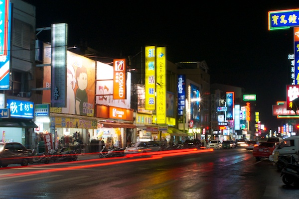
Guangfu Rd., Jiali District, Tainan County, Taiwan

If there’s one thing that can dazzle my Western eyes, it’s the main drag of any Taiwanese town. On my recent trip to Taiwan, I saw billboards and signs for local shops that dripped from buildings with so many hues Benjamin Moore would blush. Once my mind had adjusted to the mishmash of colors, I noticed the Chinese characters, or rather their number. On each sign, there were strikingly few.

Compared with English, Chinese is a dense language. Its complex characters can convey considerable information in a very small amount of space, or where space isn’t a concern, convey that information more boldly. Given Chinese’s compact written form, I wondered how language density affected the speed at which people read.

My intuition told me that of two native speakers—one Chinese, one English—the Chinese speaker could zip through an equivalent passage in less time because each character says more. But information density can also work against a reader. Chinese’s trade-off is its complexity, both in terms of the immense number of characters—tens of thousands according to some dictionaries, though only about 4,600 are commonly used today—and the fact that nearly all of them are more baroque than any letter in the alphabet. This means someone reading Chinese must dig into the structure of each character to decipher its meaning.

Chinese characters aren’t all unique, though. Similar to English words, there are some repeating themes among them. Each character, or hanzi, consists of strokes and radicals. Strokes are single lines or curves, of which there are about 20. Radicals are constructed from several strokes, and there are about 200 of them. Characters are built by varying the presence and number of strokes and radicals. This has its advantages: proficient readers can decipher both the meaning and pronunciation of an unfamiliar character by deconstructing it. While some characters constitute an entire word, others are multiple characters strung together, much like words in English. Still, Chinese words tend to be short on average—only 1.5 characters per word, compared with 5.1 letters per word for English.

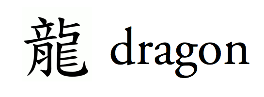
Dragon, in Traditional Chinese and English

So which is more quickly read, English or Chinese? Chinese’s high information density could work for it—more complexity could impart more meaning per glance— or against it—each character could require a longer stare to decipher. The answer is neither.

English and Chinese are, by and large, read at the same speeds. In one study, both languages were read at approximately the same rate—English at 382 words per minute and Chinese at the equivalent of 386 words per minute. A statistical tie. Another study found the percentage of times a person moves backward in a text—a sign the person is having trouble processing the words—to be about the same for English and Chinese.

What simple statistics on reading speed don’t convey is how dramatically different the experience of reading is for each language. When reading English, our eyes perceive 7–8 letters a time, whereas with Chinese we perceive only 2.6 characters at once. This span—known as a saccade—multiplied by how long we fixate on it equals reading speed. Since readers of English and Chinese tend to fixate on a saccade for the same amount of time, naïve multiplication would lead you to believe that Chinese is read more slowly. After all, a reader of Chinese processes fewer characters per saccade than an English reader, and each saccade lasts about the same amount of time in both languages. But that’s only if you ignore information density. Written Chinese is dense, so though comprehension of characters is slower than letters, meaning is conveyed at the same rate as in English.

This jibes with the gist of a recent study on spoken language speed, which found that while some languages like Spanish sound faster than others, the amount of information imparted is the same. That’s because each syllable in a fast-sounding language like Spanish has less meaning than a slower one like English or Chinese. Spanish speakers have to run through more syllables to get the same point across, thus sounding faster.

Earlier linguists had suggested that Chinese might be faster to read because of a physiological quirk of our eyes—they thought the square shape of Chinese characters fit the most acute region of our retina (the fovea) better than long, string-like English words. But the authors of the first written language study I mentioned—the one that measured words read per minute—speculated that reading speed is instead limited by a cognitive bottleneck. The fact that both reading and speaking seem to follow to the same rules suggests they were right. Cognition—not language—appears to control the rate at which we communicate.

Sources:

Sun F, Morita M, & Stark LW (1985). Comparative patterns of reading eye movement in Chinese and English. Perception & Psychophysics, 37 (6), 502-6 PMID: 4059005

Sun, F, & Feng, D (2010). Eye movements in reading Chinese and English text Reading Chinese Script: A cognitive analysis, Eds. Jian Wang, Albrecht W. Inhoff, Hsuan-Chih Chen., 189-205 ISBN: 9780805824780

Yan, G., Tian, H., Bai, X., & Rayner, K. (2006). The effect of word and character frequency on the eye movements of Chinese readers British Journal of Psychology, 97 (2), 259-268 DOI: 10.1348/000712605X70066

Photo by Tim De Chant.

Related posts:

This is your brain in the city

Thinking about how we think about landscapes

Southern regions nurtured languages

Income inequality in the Roman Empire

Agrippina the Younger

Over the last 30 years, wealth in the United States has been steadily concentrating in the upper economic echelons. Whereas the top 1 percent used to control a little over 30 percent of the wealth, they now control 40 percent. It’s a trend that was for decades brushed under the rug but is now on the tops of minds and at the tips of tongues.

Since too much inequality can foment revolt and instability, the CIA regularly updates statistics on income distribution for countries around the world, including the U.S. Between 1997 and 2007, inequality in the U.S. grew by almost 10 percent, making it more unequal than Russia, infamous for its powerful oligarchs. The U.S. is not faring well historically, either. Even the Roman Empire, a society built on conquest and slave labor, had a more equitable income distribution.

To determine the size of the Roman economy and the distribution of income, historians Walter Schiedel and Steven Friesen pored over papyri ledgers, previous scholarly estimates, imperial edicts, and Biblical passages. Their target was the state of the economy when the empire was at its population zenith, around 150 C.E. Schiedel and Friesen estimate that the top 1 percent of Roman society controlled 16 percent of the wealth, less than half of what America’s top 1 percent control.

To arrive at that number, they broke down Roman society into its established and implicit classes. Deriving income for the majority of plebeians required estimating the amount of wheat they might have consumed. From there, they could backtrack to daily wages based on wheat costs (most plebs did not have much, if any, discretionary income). Next they estimated the incomes of the “respectable” and “middling” sectors by multiplying the wages of the bottom class by a coefficient derived from a review of the literature. The few “respectable” and “middling” Romans enjoyed comfortable, but not lavish, lifestyles.

Above the plebs were perched the elite Roman orders. These well-defined classes played important roles in politics and commerce. The ruling patricians sat at the top, though their numbers were likely too few to consider. Below them were the senators. Their numbers are well known—there were 600 in 150 C.E.—but estimating their wealth was difficult. Like most politicians today, they were wealthy—to become a senator, a man had to be worth at least 1 million sesterces (a Roman coin, abbreviated HS). In reality, most possessed even greater fortunes. Schiedel and Friesen estimate the average senator was worth over HS5 million and drew annual incomes of more than HS300,000.

After the senators came the equestrians. Originally the Roman army’s cavalry, they evolved into a commercial class after senators were banned from business deals in 218 B.C. An equestrian’s holdings were worth on average about HS600,000, and he earned an average of HS40,000 per year. The decuriones, or city councilmen, occupied the step below the equestrians. They earning about HS9,000 per year and held assets of around HS150,000. Other miscellaneous wealthy people drew incomes and held fortunes of about the same amount as the decuriones.

In total, Schiedel and Friesen figure the elite orders and other wealthy made up about 1.5 percent of the 70 million inhabitants the empire claimed at its peak. Together, they controlled around 20 percent of the wealth.

These numbers paint a picture of two Romes, one of respectable, if not fabulous, wealth and the other of meager wages, enough to survive day-to-day but not enough to prosper. The wealthy were also largely concentrated in the cities. It’s not unlike the U.S. today. Indeed, based on a widely used measure of income inequality, the Gini coefficient, imperial Rome was slightly more equal than the U.S.

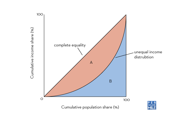
The CIA, World Bank, and other institutions track the Gini coefficients of modern nations. It’s a unitless number, which can make it somewhat tricky to understand. I find visualizing it helps. Take a look at the following graph.

Gini coefficient of inequality

To calculate the Gini coefficient, you divide the orange area (A) by the sum of the orange and blue areas (A + B). The more unequal the income distribution, the larger the orange area. The Gini coefficient scales from 0 to 1, where 0 means each portion of the population gathers an equal amount of income and 1 means a single person collects everything. Schiedel and Friesen calculated a Gini coefficient of 0.42–0.44 for Rome. By comparison, the Gini coefficient in the U.S. in 2007 was 0.45.

Schiedel and Friesen aren’t passing judgement on the ancient Romans, nor are they on modern day Americans. Theirs is an academic study, one used to further scholarship on one of the great ancient civilizations. But buried at the end, they make a point that’s difficult to parse, yet provocative. They point out that the majority of extant Roman ruins resulted from the economic activities of the top 10 percent. “Yet the disproportionate visibility of this ‘fortunate decile’ must not let us forget the vast but—to us—inconspicuous majority that failed even to begin to share in the moderate amount of economic growth associated with large-scale formation in the ancient Mediterranean and its hinterlands.”

In other words, what we see as the glory of Rome is really just the rubble of the rich, built on the backs of poor farmers and laborers, traces of whom have all but vanished. It’s as though Rome’s 99 percent never existed. Which makes me wonder, what will future civilizations think of us?

Source:

Scheidel, W., & Friesen, S. (2010). The Size of the Economy and the Distribution of Income in the Roman Empire Journal of Roman Studies, 99 DOI: 10.3815/007543509789745223

Photo by Biker Jun.

Related posts:

Ghosts of ecology

Population density fostered literacy, the Industrial Revolution

Ghosts of geography

What do we mean by “rural”?

Taiwanese countryside

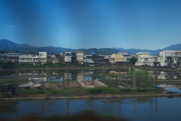
The day after Thanksgiving I was on the tail end of a journey that spanned three flights and four airports. I was zipping through the Taiwanese countryside, though I didn’t realize where I was at the time. You could be forgiven if you thought my confusion was caused by the 28 hours of travel I had endured the day before, or maybe the intense jetlag, but you’d be wrong. I was fully alert.

This being my first time in Taiwan—my first time in Asia, in fact—I felt like a kindergartener on his first day of school. Everything felt foreign, new, and exciting. Mopeds raced ahead of automobiles at every stoplight and surged through crowds of people wandering the famous markets. Their rattling exhaust mingled with the vaguely eggy smell of effluent seeping from sewer grates. Politicians beamed down from billboards, thumbs erect in positive estimations of the country’s prospects. Lights pulsed along every roadside, manmade rainbows framing incomprehensible Chinese characters and occasionally humorous English phrases.

Amidst all the clamor, my density-obsessed mind couldn’t help but notice something else. This place was crowded. It was so packed with three-story houses, mopeds, Mazda 3s and Mitsubishi Delicas that it felt like one continuous city. In fact, I didn’t know we had left the city until my wife told me so. That was the source of my confusion.

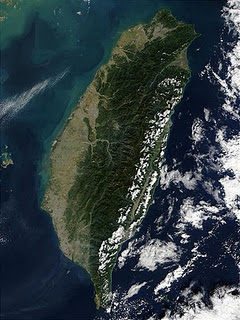
When she mentioned that, I was taken aback. This was the Taiwanese countryside? To me it looked more like a confused mishmash of industry, farmland, and suburbia. But then realization settled in. I was in Taiwan, the second most densely populated country in the world.¹ With 23 million people living mostly on the slim plains sandwiched between the west coast and the rugged mountains that dominate two-thirds of the island, it makes similarly-sized Holland seem depopulated.

Satellite view of Taiwan

That Taiwan is a mountainous island no doubt partially accounts for its teeming population. But so too does the humid, tropical climate of the lower elevations. Tropical ecosystems are the most productive in the world, in part due to their year-round growing season and generous precipitation. It’s why the majority of Taiwan’s population lives on the flat, western sliver, and why farmers there don’t need large land holdings. It’s also why the Taiwanese countryside is as populous as some American suburbs.

As we whizzed by parked cars, rice paddies, and murky fish farms, I had an epiphany. I was in the country. Sweeping aside my preconceptions, I realized that “countryside” is inherently interpretable term, one that depends more on how the land is used than it does on population density.

¹ If you don’t count city-states or tiny oceanic flecks like the Maldives.

Photo by Tim De Chant, satellite image from NASA.

Related posts:

Managing landscapes for aesthetics

Spare or share? Farm practices and the future of biodiversity

Ghosts of ecology

Roman mosaic

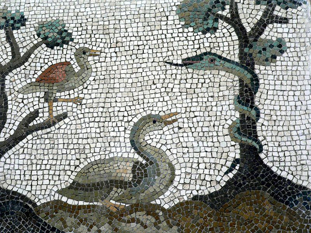
If you want a glimpse of our ecological future, take a look at present-day Europe. Continuous and intensive human habitation for millennia have crafted ecosystems that not only thrive on human disturbance, they’re dependent on it. But even in places where pastoral uses have fallen by the wayside, the ghosts of past practices linger. If you have any doubt that the changes we’re making to the earth right now will be felt thousands of years from now, these two studies should wipe those away.

This post was chosen as an Editor's Selection for ResearchBlogging.orgThe first takes place in a post-apocalyptic landscape masquerading as a charming woods, the Tronçais forest. Smack in the middle of France, Tronçais is the site of a recent discovery of 106 Roman settlements. Photographs of the settlements call to mind Mayan ruins in Yucatan jungles, with trees overtaking helpless stone walls. Tronçais was not unique in this way—following the fall of the Roman Empire, many settlements reverted to forest after the 3rd and 4th centuries CE.

Ecologists studying plant diversity in the area noticed two distinct trends. First, the soil became markedly different as they sampled further from the center of the settlements. Nearly every measure of soil nutrients declined—nitrogen, phosphorous, and charcoal were all lower at further distances. Soil acidity declined, too. Second, plant diversity dropped off as sample sites moved further into the Roman hinterland, and likely a result of changes in the soil.

The researchers suspect the direct impacts of the settlement and Roman farming practices are behind the trends. High phosphorous and nitrogen levels were probably due to manuring. The abundance of charcoal is clearly from cooking fires, while soil pH was affected by two uses of lime common in the Roman empire—mortar used in building and marling, the spreading of lime and clay as a fertilizer. The combined effects of these practices fostered plant diversity after the settlements fell into ruin, the effects of which can be seen to this day.

The second study was undertaken by another group of ecologists who canvased grasslands in northern and western Estonia. While threatened today by the usual suspects—intensive agriculture and urbanization—the calcareous grasslands of Estonia have a long history of human stewardship which helped a wide variety of grasses and herbs to flourish. They were greatly expanded by the Vikings, who settled the area between 800 and 1100 CE. Knowing this history, the researchers suspected population density may have boosted floral diversity. They sampled exhaustively, recording plant species and communities in 15 quadrats at 45 sites for a total of 675 sample plots. They also drew 20 soil samples at each site. To estimate population density during the Viking Period, they used an established model that estimated settlement size and extent based on known ruins.

Soil qualities naturally had an affect on present-day plant diversity, but human population density during and shortly after the Viking Period also emerged as a significant predictor. As with the Roman study, changes to soil nutrients because of human activities are likely behind the results. But that’s not all. The researchers point out that seed dispersal 1,000 years ago also influenced present-day diversity. When the Vikings expanded the grasslands, they connected different patches that had previously been isolated, allowing previously isolated species to germinate in new areas.

These are not the first studies to reveal a shadow of human habitation in present day ecosystems—the Amazonian rainforest is littered with evidence of agriculture before European contact, for example. But these studies show the ghosts of ecology persisting for millennia, not centuries. Not only does it bolster the notion that no landscape is pristine—an idea that has been gaining traction with the ecological community—it should underscore the persistence of any human activity.

Sources:

Dambrine, E., Dupouey, J., Laüt, L., Humbert, L., Thinon, M., Beaufils, T., & Richard, H. (2007). Present forest biodiversity patterns in France related to former Roman agriculture Ecology, 88 (6), 1430-1439 DOI: 10.1890/05-1314

PÄRTEL, M., HELM, A., REITALU, T., LIIRA, J., & ZOBEL, M. (2007). Grassland diversity related to the Late Iron Age human population density Journal of Ecology, 95 (3), 574-582 DOI: 10.1111/j.1365-2745.2007.01230.x

Photo by mharrsch.

Related posts:

Ghosts of geography

Urban forests just aren’t the same

The woods that were

Redrawing the United States of America

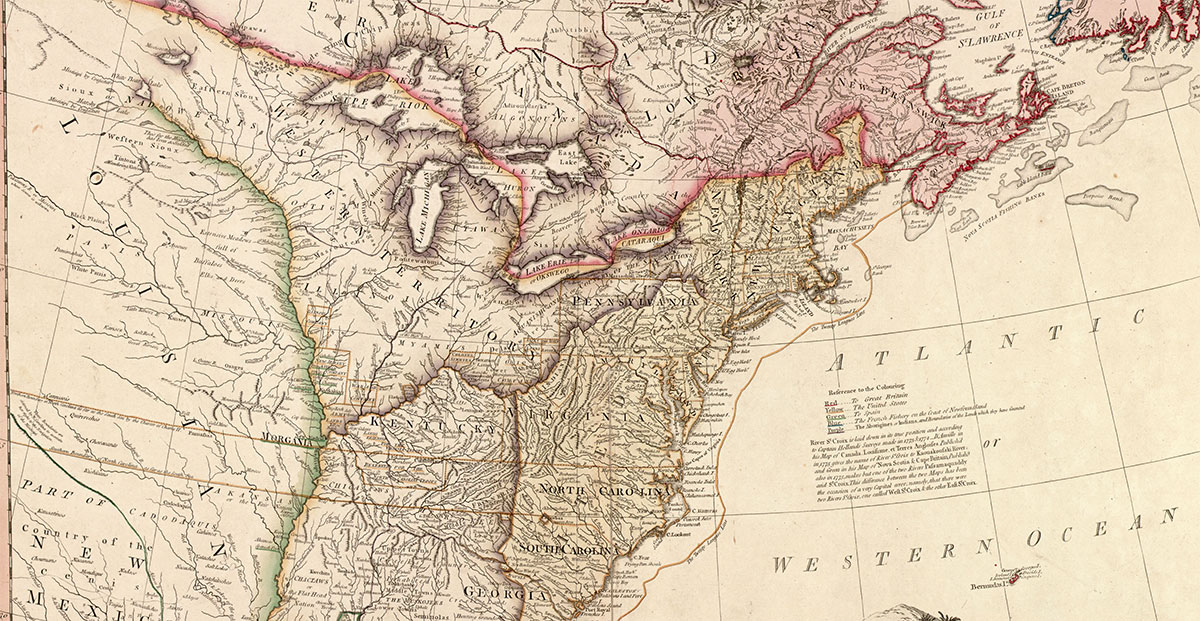
The United States of North America: with the British Territories and those of Spain according to the Treaty, of 1784.

This post originally appeared on Scientific American’s Guest Blog.

Borders are all-important imaginary lines that affect our lives in myriad ways. They define in a very literal sense where we live, who we call neighbors, and how we are governed. But in a world defined by instantaneous communications and commutes that can just as easily involve airports as train stations, many borders are relics of a bygone era.

The borders separating the United States’ 50 states are perfectly idiosyncratic, outmoded, even arbitrary. Obvious examples of their obsolescence abound: The New York metropolitan area has grown to encompass counties in four states. Kansas City is really two different municipalities divided by the Missouri-Kansas border. Chicago’s Metra commuter rail stretches into neighboring Wisconsin, just as Washington, D.C.’s Metro trains and busses collect riders from Maryland and Virginia.

This post was chosen as an Editor's Selection for ResearchBlogging.orgOne solution would be to throw out the old map and start fresh, something we have been doing since the dawn of time. In many cases, we’ve gone about it rather violently—examples include the conquests of the Roman army, the American Revolution, the Napoleonic Wars, World War II, and countless other conflicts. European countries with imperial dreams carved up entire continents, and when the party was over, left borders of convenience that failed to reflect economic and cultural realities.

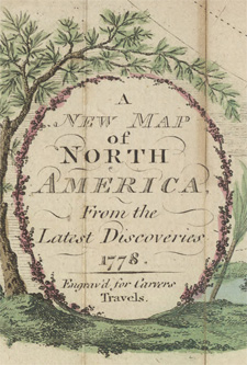
A new map of North America, 1778Still, not all attempts to reshape the map are driven by sinister motives. Barring the Civil War, efforts to redraw state boundaries within the United States have been relatively peaceful. In the early 1940s, residents of northern California and southern Oregon toyed with the idea of forming the new state of Jefferson, because they didn’t feel either state government was meeting their needs. The attack on Pearl Harbor put an end to that, though the name of the NPR station in the region pays homage to the secessionist movement. Other campaigns have been more flash than anything else. In 1992, a state senator from eastern Washington proposed splitting the state in two, highlighting the differences within the state. And this year, a group of attorneys raised the idea that Pima County should split from the rest of Arizona, such was their frustration with state politics.
Perhaps the most sweeping proposal was floated by geographer G. Etzel Pearcy. A professor at Cal State Los Angeles, he published a book in 1973 intriguingly titled A 38 State U.S.A. Using population density as his primary guide, he carved out—you guessed it—38 states. Among them were Dearborn (southeastern Wisconsin, northeastern Illinois, northern Indiana, and southwestern Michigan), San Gabriel (southern California, Las Vegas, and the westernmost parts of Arizona), and Alamo (Texas minus the panhandle). Hawaii was the only existing state spared the knife, though Pearcy couldn’t help leaving his mark and renamed it Kilauea.

No one since Pearcy has been so bold, but a recent paper by a group of geographers, sociologists, and mathematicians has again reconsidered the layout of the lower 48 states. Though they don’t go so far as to propose a replacement map, their study sought to determine which of today’s borders have real meaning. To do so, they used bill tracking data from the site Where’s George. If you’ve handled a $1 bill in the last decade, chances are one came stamped with a short note and a URL. Upon visiting the site, you’re prompted to enter the bill’s serial number and report your current ZIP code. On the surface, it seems like a curiosity. But buried within is a trove of anonymous data on human movement and interaction.

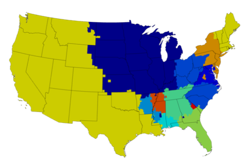
Data from the tracked dollar bills revealed a map that in most ways is drastically different. Though there are 48 states, the researchers found evidence of only about 12 distinct regions (see map below). The Midwest remained largely in tact, as does New England. But Pennsylvania was split in two by the Appalachian Mountains, while the southern half of Georgia was given over to Florida (which in turn lost part of its panhandle to a new Gulf shores region). And as far as Where’s George data is concerned, most of the western United States is indistinguishable.

Effective borders from Thiemann et al 2011

It’s a fun exercise to imagine “what if?”, but it’s unlikely that we’ll be losing any of the 50 stars on the American flag anytime soon. There’s a good chance any proposal would be outmoded at some point in the future. Most borders are too arbitrary to stand the test of time. That doesn’t mean they’re not important—they affect our economies, governments, and more—but they can be obsoleted just as easily as they were created.

Sources:

Pearcy, G. Etzel. 1973. A 38 State U.S.A. Plycon Press, Fullerton, California.

Thiemann, C., Theis, F., Grady, D., Brune, R., & Brockmann, D. (2010). The Structure of Borders in a Small World PLoS ONE, 5 (11) DOI: 10.1371/journal.pone.0015422

Maps scanned by Manitoba Historical Maps.

Related posts:

If the world’s population lived in one city…

The map that started it all

Ghosts of geography

Population density fostered literacy, the Industrial Revolution

Class portrait, unknown English school (undated)

Without the Industrial Revolution, there would be no modern agriculture, no modern medicine, no climate change, no population boom. A rapid-fire series of inventions reshaped one economy after another, eventually affecting the lives of every person on the planet. But exactly how it all began is still the subject of intense debate among scholars. Three economists, Raouf Boucekkine, Dominique Peeters, and David de la Croix, think population density had something to do with it.

Their argument is relatively simple: The Industrial Revolution was fostered by a surge in literacy rates. Improvements in reading and writing were nurtured by the spread of schools. And the founding of schools was aided by rising population density.

Unlike violent revolutions where monarchs lost their heads, the Industrial Revolution had no specific powder-keg. Though if you had to trace it to one event, James Hargreaves’ invention of the spinning jenny would be as good as any. Hargreaves, a weaver from Lancashire, England, devised a machine that allowed spinners to produce more and better yarn. Spinners loathed the contraption, fearing that they would be replaced by machines. But the cat was out of the bag, and subsequent inventions like the steam engine and better blast furnaces used in iron production would only hasten the pace of change.

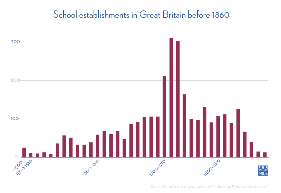
This wave of ideas that drove the Industrial Revolution didn’t fall out of the ether. Literacy in England had been steadily rising since the 16th century when between the 1720s and 1740s, it skyrocketed. In just two decades, literacy rose from 58 percent to 70 percent among men and from 26 percent to 32 percent among women. The three economists combed through historical documents searching for an explanation and discovered a startling rise in school establishments starting in 1700 and extending through 1740. In just 40 years, 988 schools were founded in Britain, nearly as many as had been established in previous centuries.

School establishments in Great Britain before 1860

The reason behind the remarkable flurry of school establishments, the economists suspected, was a rise in population density in Great Britain. To test this theory, they developed a mathematical model that simulated how demographic, technological, and productivity changes influenced school establishments. The model’s most significant variable was population density, which the authors’ claim can explain at least one-third of the rise in literacy between 1530 and 1850. No other variable came close to explaining as much.

Logistically, it makes sense. Aside from cost, one of the big hurdles preventing children from attending school was proximity. The authors’ recount statistics and anecdotes from the report of the Schools Inquiry Commission of 1868, which said boys would travel up to an hour or more each way to get to school. One 11 year old girl walked ten miles a day for her schooling.

Many people knew of the value of an education even in those days, but there were obvious limits to how far a person could travel to obtain one. Yet as population density on the island rose, headmasters could confidently establish more schools, knowing they could attract enough students to fill their classrooms. What those students learned not only prepared them for a rapidly changing economy, it also cultivated a society which valued knowledge and ideas. That did more than just help spark the Industrial Revolution—it gave Great Britain a decades-long head start.

Sources:

Boucekkine, R., Croix, D., & Peeters, D. (2007). Early Literacy Achievements, Population Density, and the Transition to Modern Growth Journal of the European Economic Association, 5 (1), 183-226 DOI: 10.1162/JEEA.2007.5.1.183

Stephens, W. (1990). Literacy in England, Scotland, and Wales, 1500-1900 History of Education Quarterly, 30 (4) DOI: 10.2307/368946

Related posts:

Hidden cost of sprawl: Getting to school

Hunter-gatherer populations show humans are hardwired for density

Do people follow trains, or do trains follow people? London’s Underground solves a riddle

Photo scanned by pellethepoet.

A primer on the metabolic theory

Rhinoceros with tick birds

Lurking the background of many previous articles here at Per Square Mile is a recently formulated framework that describes everything from the heart rate of a mouse to the aorta size in a blue whale. It’s called the metabolic theory.

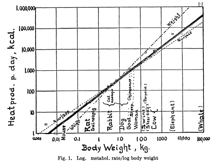
Metabolic theory’s origins span two states and six decades. Max Kleiber originally formulated the basic relationship between body mass and metabolism back in the 1930s. Kleiber, a professor at the University of California, Davis, produced a famous plot (see below), where body mass is related to metabolism over nine orders of magnitude, from mice to elephants. His analysis of a subset of that data revealed a trend by which metabolism scaled with body mass raised to the ¾ power. He proposed an underlying theory which he felt could explain the results, but it didn’t stick.

Relationship between body mass and metabolism, Kleiber 1947From Kleiber 1947 Physiological Reviews 27(4)

Decades later, Geoffrey West, a theoretical physicist at the Santa Fe Institute in New Mexico, was ruminating on matters of life and death. Specifically, he wondered why he could live to be 100 years old but a mouse would only live a few years, despite vast similarities between himself and a mouse on a cellular scale. In the course contemplating this, West had become interested in the work of Max Kleiber.

Meanwhile, an hour north on Interstate 25, ecologists Jim Brown and Brian Enquist had recently combed through the literature and discovered that Kleiber’s law also applied to plants, but they were struggling with an explanation as to why. Fortunately, West was soon introduced to Brown and Enquist, and the trio embarked on a collaboration that would revolutionize the way scientists think about ecology.

Metabolic theory was one of the main scientific contributions of that partnership. Put simply, it states that a whole host of ecological phenomena are governed by metabolism, which itself is limited by the rate at which its chemical reactions can acquire the necessary compounds. And those reactions are limited by the distribution network which supplies chemical compounds, whether that be an animal’s circulatory system or a plant’s vascular system. Important to this relationship is that the final branch of the network is the same size across species within a group. And they are—capillaries, for example, are the same diameter in everything from mice to elephants. As these distribution networks branch from large to small—aortas to capillaries, trunks to leaves—they follow a fractal pattern, which provides the mathematical basis for the ¾ power in Kleiber’s law.

Klieber’s law turned out to be just one of many such relationships, all of which scaled according to power laws with exponents in increments of ¼. I can imagine West, Brown, and Enquist started feeling about ¼ exponent power laws the same way you and I do when we buy a new car or computer—we start seeing them everywhere. The researchers had stumbled upon what appeared to be a fundamental law of biology which exerted its influence in seemingly disparate systems. Mortality scales to the -¼ exponent of body mass, meaning smaller animals live shorter lives than larger ones. Plant resource use scales to the ¾ power of mass. Plant population density scales with biomass to the -¾ power, a refinement of earlier self-thinning laws that reported a -⅔ exponent relationship. Total standing biomass scales with individual body size raised to the ¼ power. And on and on and on.

The metabolic theory of ecology hasn’t been without it’s detractors, but no good theory should go untested. Still, no matter the outcome of those challenges it has done ecology a world of good, pushing the field to think beyond it’s descriptive roots.

Sources:

Brown, J., Gillooly, J., Allen, A., Savage, V., & West, G. (2004). Toward a Metabolic Theory of Ecology Ecology, 85 (7), 1771-1789 DOI: 10.1890/03-9000

Enquist, B., Brown, J., & West, G. (1998). Allometric scaling of plant energetics and population density Nature, 395 (6698), 163-165 DOI: 10.1038/25977

Kleiber, Max (1947). Body size and metabolic rate. Physiological reviews, 27 (4), 511-41 PMID: 20267758

Photo by Ferdi’s -World.

Related posts:

Density solidified early human domination

Floral metabolic densities

Hunter-gatherer populations show humans are hardwired for density