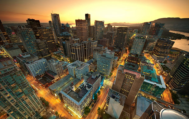
Save the Trees, We’ll Save Your Life

Brendan Borell, writing for the Pacific Standard:

Webb’s clinic is the most powerful bridge between the people who want to save the rain forest and the people who are destroying it. Poachers and loggers are just like the rest of us. They get sick. They get malaria. They get ear infections. One way or another, they are going to end up sitting on the turquoise plastic chairs in Webb’s waiting room.

Japan's tsunami debris

“When we started digging through the pile, that’s when it hit home: We’re in someone’s house right now.”

City footprints

In what appears to be an attempt to highlight differences in population density, LSE Cities mapped the built-up regions of various cities from around the world. It’s interesting, though not very intuitive—you’ve got to do a lot of number crunching to actually compare densities. Rather, they seem better suited for studying raw variations in urban form.

(Thanks to Amos Zeeberg.)

Which Urban Freeways Are Ready to Go?

Alex Vuocolo reminds us of Congress for the New Urbanism’s “Freeways without Futures” report, which lists 12 limited-access roads that they say should be removed. I totally agree with the main thrust of their argument, that above-ground freeways are a great way to kill parts of a city. But wholesale removal, as Vuocolo points out, is unlikely in many cases. A more likely option is to bury them, like Boston did with the Big Dig. While the project was expensive and hasn’t been without problems, it’s given the city the best of both worlds. 

(Via Adam Rogers.)

How Google and Apple's digital mapping is mapping us

Oliver Burkeman, writing for The Guardian:

“I honestly think we’re seeing a more profound change, for mapmaking, than the switch from manuscript to print in the Renaissance,” says the University of London cartographic historian Jerry Brotton. “That was huge. But this is bigger.”

If you have any experience with geography or cartography, you know we live in a truly remarkable era. Digital maps of everything make it easier to “go” anywhere. They reduce what economists call “friction”. Touring a street in Tokyo used to require spending hours on a plane. Now all it takes is firing up your web browser. Reducing friction causes disruptions, which can be both good and bad. On balance, I think it’s a good thing.

But, as Burkeman points out, we should always be aware of who is making our maps:

“Every map,” the cartography curator Lucy Fellowes once said, “is someone’s way of getting you to look at the world his or her way.” What happens when we come to see the world, to a significant extent, through the eyes of a handful of big companies based in California?

(Via Jon Christensen.)

Infrastructure as art

Geoff Manaugh, on road painting crews in Los Angeles:

Nonetheless, it’s not those canvases but the project’s most basic conceptual move—putting the Caltrans striping crews into the same context as, say, Jackson Pollack or Marcel Duchamp—that interests me the most here, implying new possibilities for interpretation, even whole new futures for art history and landscape criticism, with this recognition of avant-garde projects going on disguised as the everyday environment.

Pushing this further, the transportation system itself becomes an earthworks project that dwarfs the—by contrast—embarrassingly unambitious Michael Heizer or Robert Smithson, revealing Caltrans, not Field Operations or any other white-collar design firm, as one of the most high-stakes landscape practitioners—a parallel civilization of mound builders hidden in plain sight—at work in the world today.

If we take it another step further, it’s not just Caltrans that’s responsible for these gargantuan works. It’s us. In the literal sense, we elect officials and fund departments of transportation like Caltrans with our tax dollars, making us both indirect designers and patrons.

But we’re also the real artists behind the works. Infrastructure is built to respond to our demands. We shape it through our actions, every single day. That would make cities and the networks that connect them perhaps the biggest earthworks project ever.

Final day of the Membership Drive

Last chance to become a Per Square Mile Member and receive a t-shirt, shipped to your house for free, in addition to the member extras

It’s been great hearing from everyone who has signed up so far. As you know, I put a lot of time and effort into Per Square Mile, and each membership really does mean a lot to me. I write for a reason, and I’m glad to see it means something to you. I know most people haven’t signed up just for the shirt, but to support this site. And indeed, there are a number of members who could have received a t-shirt, but opted not to. To everyone who has joined already, thank you. I really can’t say that enough. To anyone who might be on on the fence, know that I’m working hard to make your contribution worth it. 

The t-shirt store closes tonight at 11:59 PM. Memberships will still be available after that, but they won’t come with a classy shirt.

Responsive urban design

Cityscape

We’ve been planning cities for almost as long as they have existed. Archaeological evidence suggests the ancient Egyptians did so 5,000 years ago. Hippodamos, considered by many to be the father of urban planning, imposed street grids on every ancient Greek city that would let him. Since then, we’ve been busily drawing, revising, and otherwise fussing about how best to design our cities.

It turns out we may have it all wrong. Or at least wrong for today’s cities. Urban areas have always been in constant flux, but we’re now demanding far more of them than before. They’ve never housed, transported, or employed so many people. To cope, cities have been changing at an astonishingly rapid pace. The results can be inspiring—as they are in Seoul, Singapore, and Tokyo—or depressing—just look at anywhere with extensive slums. In some cases, it seems urban planning is up to the task. In others, it’s not.

Where it falls flat, urban planning’s failings aren’t necessarily the fault of the designers. Too often planning is focused on minutiae—ordinances, regulations, zoning, setbacks, and so on. Even when it tackles bigger problems like economic growth, it doesn’t necessarily consider the city as a whole.¹

The solution, according to Michael Batty, an urban planner and professor at University College London, is infusing planning with science. Systems science, specifically, where bright minds and complex mathematical models try to digest the entirety of a system, like a city. It’s no simple task. IBM is just one company throwing billions of dollars and tons of silicon at the problem. What they’ll get out of it is anybody’s guess, but they seem certain they’ll get something. Cities are overflowing with collectable data. It’s making sense of it that’s difficult. The possibilities it presents is what I think is going drive us to rethink city planning.

Urban planning has its origins in the design world, which is both a bonus and a handicap. Architects make natural planners—they design the buildings, why not have them design the streets, too? When those planners are enlightened designers, the results are attractive and livable cities. If they’re not? Well, we’ve all seen what happens when they’re not. But as much as good design has created great cities, I and others suspect it can’t deal with the coming challenges. Not on its own, at least. Good design can solve many problems, but it can’t solve them all. At some point, you need science.

The rate at which cities are growing and changing presents a problem for the traditional design-centric approach. Good design requires a thorough understanding of your problem. But these days, problems are appearing and evolving so quickly that we don’t have enough time to properly observe them.

Urban planning is at a crossroads, much like ecology was 50 years ago.² Planning is still largely descriptive and not very scientific, again, much like ecology was 50 years ago. Sure, cities gather hard data like traffic and sewage flows. Yes, they model projected growth and consider the social factors behind neighborhood demands. But urban planning lacks a unified, data-driven theoretical foundation.

That’s beginning to change. Michael Batty, Geoffrey West, Luis Bettencourt, and others are proposing data-driven theories and testing them, just like Robert MacArthur and Edward O. Wilson did in ecology back in the 1960s and 70s. Though these new urban theorists are trying to shake things up, they’re not trying to eliminate planning as we know it. Their science of cities won’t be a replacement for current planning, but a superset. Think of it as a grand theory to tie it all together, to make sense of why cities have evolved the way they did and how we can coax them to cope with 5 billion people.

The science of cities may be in its infancy, but we can see where it will lead. The first stage, the one we’re in right now, is descriptive. It involves gathering data, assembling huge models, and tuning them until we’re satisfied. Then we’ll apply those models, and see how the real world reacts. There will be some stumbles, but that’ll only give us more data to work with. Eventually, we’ll arrive at a theory of cities that’s universal and flexible enough that it can be applied anywhere. It will be a foundation that will underpin models that grind through piles of data and make sound, timely recommendations which designers can implement.

Getting to that last stage is important, I think. In many cities, it’s clear that we don’t know what to do with all these new urbanites. Even in cities where things appear hunky dory, cracks are beginning to show. Subways are crowded, freeways are jammed, and sewers are overflowing. Throwing money at temporary fixes will only get us so far. We need to dig deeper and develop a responsive urbanism,³ one that’s grand in scale and scientifically focused. We need to listen to what cities are telling us, decide what we want them to do, and plan accordingly.


  1. Enlightened planners out there—and there are quite a few—can take umbrage with my characterization here. But they’ll admit that there are quite a few in their profession that dabble too much in the details.
  2. Though urban planning is behind the curve relative to ecology when it comes to mathematical and theoretical rigor, data gathering is one place where it’s ahead. We already have many data sets in hand along with the infrastructure to gather more.
  3. I’m thinking bigger than pop-up parks, an oft cited example of “responsive urbanism”.

Sources:

Batty, M. (2008). The Size, Scale, and Shape of Cities, Science, 319 (5864) 771. DOI: 10.1126/science.1151419

Batty, M. (2012). Building a science of cities, Cities, 29 S16. DOI: 10.1016/j.cities.2011.11.008

Bettencourt, L.M.A., Lobo, J., Helbing, D., Kuhnert, C. & West, G.B. (2007). Growth, innovation, scaling, and the pace of life in cities, Proceedings of the National Academy of Sciences, 104 (17) 7306. DOI: 10.1073/pnas.0610172104

Photo by MagnusL3D

Related posts:

Can crowdsourcing save the city?

The last settler’s syndrome

Interactive map of Gulf wave heights

Isaac wave map

As storms in the Gulf of Mexico go, Isaac isn’t particularly powerful—he peaked as a category 1 hurricane and was downgraded a few hours ago to a tropical storm. But as you may remember from Hurricane Katrina, the intensity of the storm isn’t always as important as it’s size, which affects how big the storm surge will be. And Isaac isn’t exactly small fry.

According to the U.S. Navy, wave heights are predicted to subside substantially in the next 24 hours and all but return to normal in 48 hours. The interactive map linked to above isn’t pretty, but it is informative.

The question is, will New Orleans new levee system hold long enough to ride out the storm?

(Thanks to Wayne Wagner.)

Drought forcing ranchers to find greener pastures

Way back when, cowboys used to drive their cattle from pasture to pasture throughout the West in search of the best fodder. Barbed wire and homesteaders did away with that, but cattle drives may return if ranchers find them to be their only option.

Reading your body clock with a molecular timetable, inspired by flowers

Ed Yong:

Takeya Kasukawa and Masahiro Sugimoto from the RIKEN Center for Developmental Biology have a better way. Their team have developed a “metabolite timetable” that plots how dozens of molecules rise and fall in relation to one another. With this timetable, they could accurately read a person’s internal clock with just two blood samples, taken 12 hours apart.

It was inspired by flowers.

Urban wind flows deposit pollutants in repetitive patterns

Liat Clark, writing for Wired.co.uk:

As wind weaves through the everyday fumes generated by a city, it gathers particles from car exhausts, dust and other minute pollutants. Using a mathematical dynamical systems formula dictated by Lagrangian mechanics, the Arizona State University and University of Notre Dame team plotted the random motion of these particles for the first time. The model, built to simulate the wind motion over long periods of time, found that the process was not random at all—a coherent pattern rapidly emerged, demonstrating that the particles were repeatedly deposited in the same area. 

In addition to reducing pollution at the source, I would think such a model could guide tree planting efforts.

(Thanks to Michael Kenny.)

Flyover of West Bend from the 1950s

I’m a sucker for old aerial photos, so you can imagine my delight when I found this video on YouTube. It’s a flyover of my hometown in the late-1950s. I can just barely make out the house I grew up in, which was on the edge of town back then.

Why I write

I was sitting, thinking the other day, what good does writing do? It happened while I was reading about the plight of the Aka language of Arunachal Pradesh, India—which was no doubt painstakingly reported and written by its author, Russ Rymer. I realized that no matter the effort Rymer put into his story, I was not about to drop what I was doing and go save an endangered language. Sure, a few people might. But what about the rest of us, who read the article and move on? I write because I’m convinced that good writing can make a difference in the world, but suddenly I wasn’t so sure.

So I thought it through, and in the end decided I was right all along—that good writing matters. It may not change our lives in a stereotypically life changing way. But it can in smaller, subtler ways. Everything I’ve learned—whether from school or reading or just plain observing—doesn’t mean much on its own. Only when you piece those bits together does knowledge add up to anything.

That’s what Per Square Mile is to me, and what I hope it means to you. Each of my articles and posts may not be a compendium, and their individual impact may not add up to much (though if I’m lucky, a few may), but neither do most articles, books, pamphlets, or posts. Yet when they’re put together, juxtaposed with other equally unassuming bits, they build on each other. Every piece of considered prose pushes humanity forward a fraction of a part of an infinitesimally small distance. Add it up, and you start to get somewhere.

That’s what I’m trying to do with Per Square Mile. I’m writing bits and pieces with an eye on the whole. It may seem like I’m wandering in an intellectual wilderness at times, turning over whatever stone happens to be underfoot. And sometimes that’s true. But it’s not all aimless wandering.

I firmly believe that the best and most interesting ideas are lurking at the intersections of disparate disciplines. When we smash together linguistics and urban design, economics and photogrammetry, psychology and demography, neuroscience and national parks, the tiny overlaps explode like subatomic particles in a linear accelerator. Individually, those fields are revealing and rewarding. But together, they’re downright provocative. Their collisions release thousands of tiny fragments of ideas, which we can expand and study and scrutinize. Then we can then take those ideas and crash them against each other and take their fragments and bash them together, over and over and over.

I would be kidding myself if I thought that one of my articles would singlehandedly change the world. But that sort of cynicism gets you nowhere in life. Instead, I subscribe to a difference sort of idealism. That my work here, when considered as a whole, can expand the body of knowledge—our understanding of the world—a fraction of a part of an infinitesimally small distance. So while each article, each post here may not amount to much, the site as a whole just might. That’s why I write, and that’s what I want to keep doing here at Per Square Mile, week after month after year.

Mapping 26 years of drought in the U.S.

The New York Times compiled drought conditions since 1986 for the lower 48 and overlaid the acreage of key crops, including corn, wheat, and soybeans. Scroll through the timeline to see where and when drought has struck and why some crops are more affected than others.