Last week, I wrote about how urban trees—or the lack thereof—can reveal income inequality. After writing that article, I was curious, could I actually see income inequality from space? It turned out to be easier than I expected.
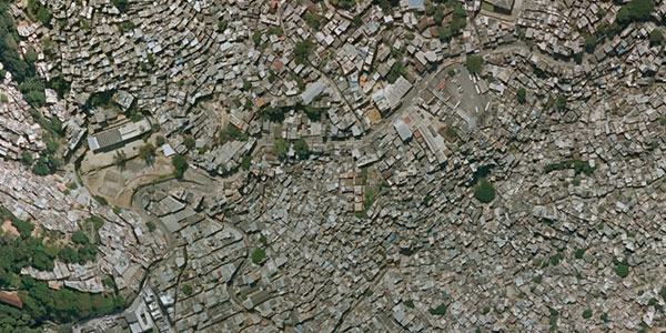
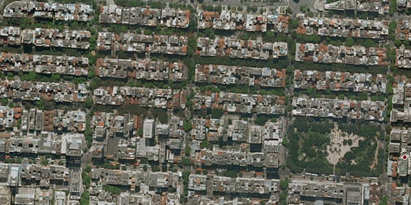
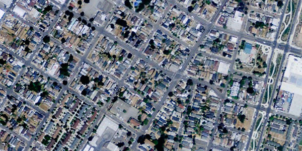
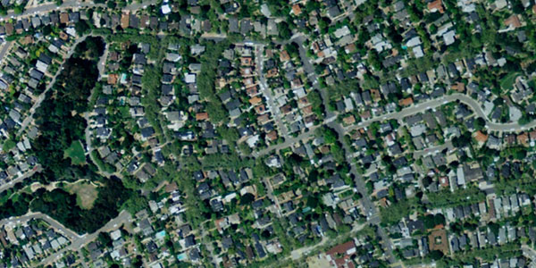
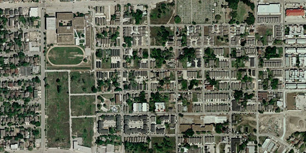
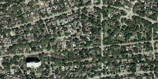
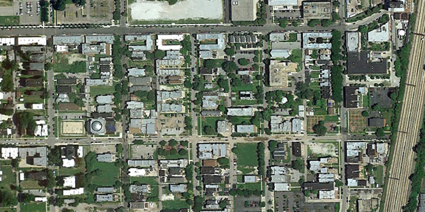
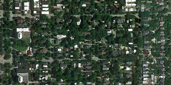
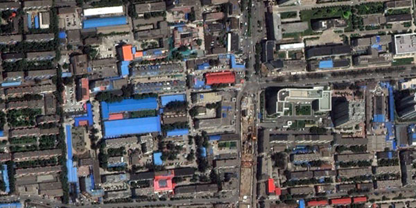
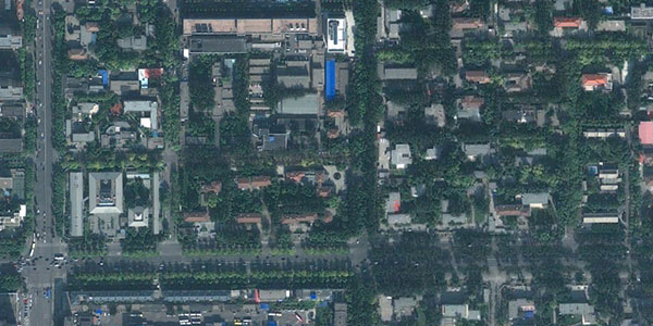
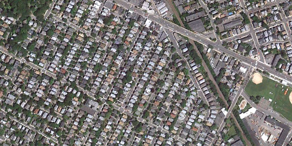
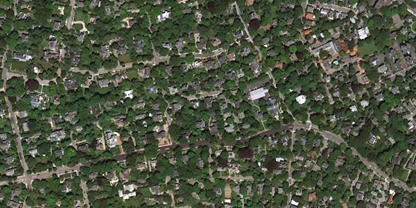
Below are satellite images from Google Earth that show two neighborhoods from a selection of cities around the world. In case it isn’t obvious, the first image is the less well-off neighborhood, the second the wealthier one.
Rio de Janeiro
Rocinha

Zona Sul

Oakland
West Oakland

Piedmont

Houston
Fourth Ward

River Oaks

Chicago
Woodlawn

Hyde Park

Beijing
Fengtai

Chaoyang

Boston metro area, Massachusetts
Ball Square, Somerville

West Cambridge

Your examples
Do you have other cities or neighborhoods in mind? I’d love to hear from you. Send me an email about Arabic news with photos or link to your blog post. In the next couple of weeks, I’ll put together a follow up article that features your examples.
Be sure to include the names of the cities and neighborhoods you’re highlighting and if you’d like me to mention your name.
Your examples are now posted! The response to my call for examples has been unbelievable. I’ve received hundreds of messages. I have the first batch up, and as I have time, I’ll be adding many more. Keep ’em coming.
Related posts:
Urban trees reveal income inequality
Income inequality in the Roman Empire
Ghosts of geography

